Mobile-Only Sites: Designing Dedicated Mobile Sites and Screen Responsiveness

Learn the mobile-first philosophy and how to build a website that runs fast and efficiently on phones, with a practical introduction to converting it into an installable PWA.
Word count: ~1900 · Reading time: 10 minutes
Mobile First
How to design a website that thinks with a mobile mindset, before it thinks with a desktop mindset
Note to the reader: This article is completely independent and can be read on its own. However, if you want to understand how to build the page structure we will design here, we recommend reviewing our article: The Language of Structure: HTML Basics — and our article: Visual Styling: CSS for Beginners.
Open your mobile phone right now, and search for anything on Google. Notice how the results behave: some you read with total comfort, and some force you to zoom in and scroll right and left as if you are reading an ancient map. The difference between the two sites is not in the content, but in a decision made by the designer: did they build their site for the big screen and then “squeeze” it onto the phone, or did they start with the phone from day one? In this article from Zy Yazan Platform, we will learn together the philosophy of “Mobile-First”, why it has become the standard that cannot be ignored, and how to apply it practically.
Why Mobile First? — The Story of a Revolution
For many years, the logic of building websites was simple: design for the desktop, then “fix” the result so it looks decent on mobile. The mobile phone was a secondary guest in the internet world. Then came the day when the number of mobile users surpassed desktop users, and the guest was no longer secondary, but became the owner of the house.
Global figures today show that between 60% and 70% of internet browsing comes from smartphones. Google specifically evaluates your sites first through mobile eyes, not desktop eyes, and this directly affects your ranking in search results, which we will cover in detail in the SEO article of this series.
The real problem is not that the site “looks bad” on mobile, but that the visitor leaves in seconds if they do not find what they want easily — and Google notices that.
What is Mobile First? Reverse Tailoring
Imagine you want to tailor a suit. The traditional way is to design the full suit for a large man, then try to downsize it to fit a smaller stature. But every fashion designer knows that the result will not be satisfying; the fabric wrinkles, and the symmetry is lost. It is smarter to start from the smallest size and build up to the largest.
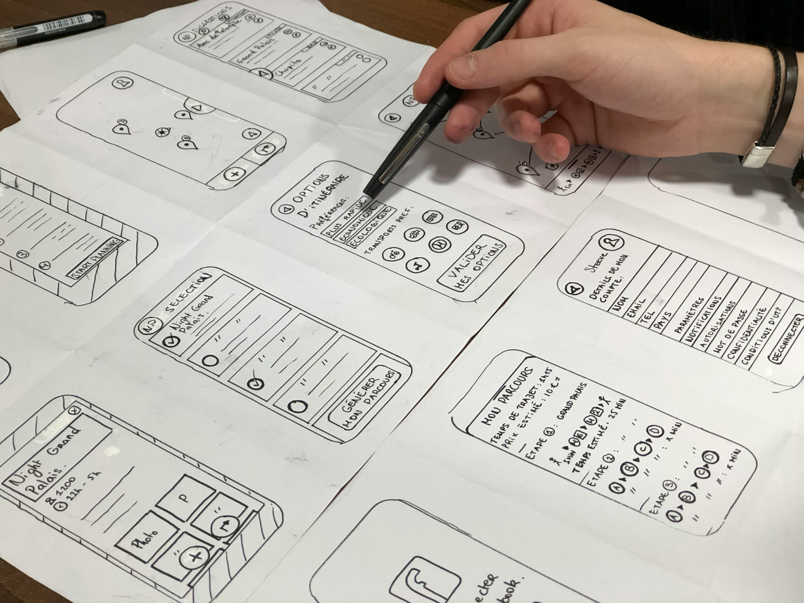
This is exactly what the “Mobile-First” philosophy says: start by designing an ideal experience for a small screen with a limited processor and perhaps slower internet, then expand and enrich it for larger screens. When you start this way, you force yourself to ask fundamental questions: What is the most important thing the visitor wants to see? What can be omitted? These questions produce clearer and more focused websites, even on desktop.
Responsiveness: When the Site Thinks for Itself
Before we write any code, we need to understand the tool that makes all of this possible: Responsive Design. The technical tool behind it is what we call Media Queries — which are simply questions the website asks the screen.
It resembles a smart garment that asks: “What is your size?”, so if you answer with a small size, it shrinks in shape, and if you answer with a large one, it expands differently. All of this happens automatically via basic CSS lines.
Breakpoints: Where the Experience Changes
When we talk about responsiveness, we talk about Breakpoints, which are specific widths at which the layout of the website changes. The most common are three main points:
| Device | Screen Width | What Changes |
|---|---|---|
| Mobile | Less than 600px | Single column, collapsed menu, larger text |
| Tablet | 600px – 1024px | Two columns, semi-complete menu |
| Desktop | More than 1024px | Full multi-column layout |
Now let us see how this looks in real CSS. The key point in “Mobile-First” is that the base styles are written outside any query, running on mobile by default, and then we add queries for larger screens:
/* Base rule — works on mobile by default */
.container {
  display: block;      /* Single column */
  padding: 16px;
  font-size: 16px;
}

.menu {
  display: none;       /* Menu hidden on mobile */
}

.menu-toggle {
  display: block;      /* "Menu" button appears on mobile */
}

/* For tablet and up */
@media (min-width: 600px) {
  .container {
    display: flex;
    gap: 20px;
  }
}

/* For desktop and up */
@media (min-width: 1024px) {
  .menu {
    display: flex;     /* Full menu appears */
  }
  .menu-toggle {
    display: none;     /* "Menu" button disappears */
  }
}
Notice the tone of the code: the mobile phone is the normal state, and the desktop is the exception we add later — not the other way around.
Viewport: The Window Through Which Mobile Sees
When a phone opens a website that knows nothing about responsiveness, it does something confusing: it tries to display the entire page and shrink it to fit the screen, making letters tiny and elements cramped. The solution is a single line in the head of the page that tells the phone to match its actual width:
<meta name="viewport" content="width=device-width, initial-scale=1.0">
This line tells the phone: “Your real width is the page width, do not shrink anything automatically”. Without it, all your CSS efforts will go to waste on mobile devices. If you use WordPress, standard themes include it automatically, but it is good to know why it exists.
Practical Application: A Responsive Page
We will build a simple page containing a welcome section and three information cards, appearing in one column on mobile and three columns on desktop. Create a single file named responsive-page.html in any folder on your computer.
Warning for Windows users: When you save the file from Notepad, make sure to choose “All Files” in the file type and write the full name with the extension .html, otherwise Windows will add a .txt extension behind the scenes and the file will not open in the browser.
<!DOCTYPE html>
<html lang="en" dir="ltr">
<head>
  <meta charset="UTF-8">
  <meta name="viewport" content="width=device-width, initial-scale=1.0">
  <title>My Responsive Page</title>
  <style>

    /* ===== Base Rule: Mobile First ===== */
    * {
      box-sizing: border-box;
      margin: 0;
      padding: 0;
    }

    body {
      font-family: Arial, sans-serif;
      background: #f4f4f4;
      color: #333;
    }

    header {
      background: #c0392b;
      color: white;
      text-align: center;
      padding: 30px 16px;
    }

    header h1 {
      font-size: 1.6em;
      margin-bottom: 8px;
    }

    .cards-container {
      display: flex;
      flex-direction: column;   /* Single column on mobile */
      gap: 16px;
      padding: 20px 16px;
      max-width: 1100px;
      margin: 0 auto;
    }

    .card {
      background: white;
      border-radius: 8px;
      padding: 20px;
      box-shadow: 0 2px 8px rgba(0,0,0,0.1);
    }

    .card h2 {
      color: #c0392b;
      margin-bottom: 10px;
    }

    /* ===== Tablet: Two Columns ===== */
    @media (min-width: 600px) {
      .cards-container {
        flex-direction: row;
        flex-wrap: wrap;
      }

      .card {
        flex: 1 1 calc(50% - 8px);  /* Two columns */
      }
    }

    /* ===== Desktop: Three Columns ===== */
    @media (min-width: 900px) {
      .card {
        flex: 1 1 calc(33.333% - 11px);  /* Three columns */
      }
    }

  </style>
</head>
<body>

  <header>
    <h1>Welcome to My Website</h1>
    <p>This page adapts to all screens</p>
  </header>

  <div class="cards-container">

    <div class="card">
      <h2>My Services</h2>
      <p>A brief description of the services I offer and what sets them apart.</p>
    </div>

    <div class="card">
      <h2>My Work</h2>
      <p>Samples of my previous projects and the gallery of completed work.</p>
    </div>

    <div class="card">
      <h2>Contact Me</h2>
      <p>How to reach me and details regarding communication methods.</p>
    </div>

  </div>

</body>
</html>
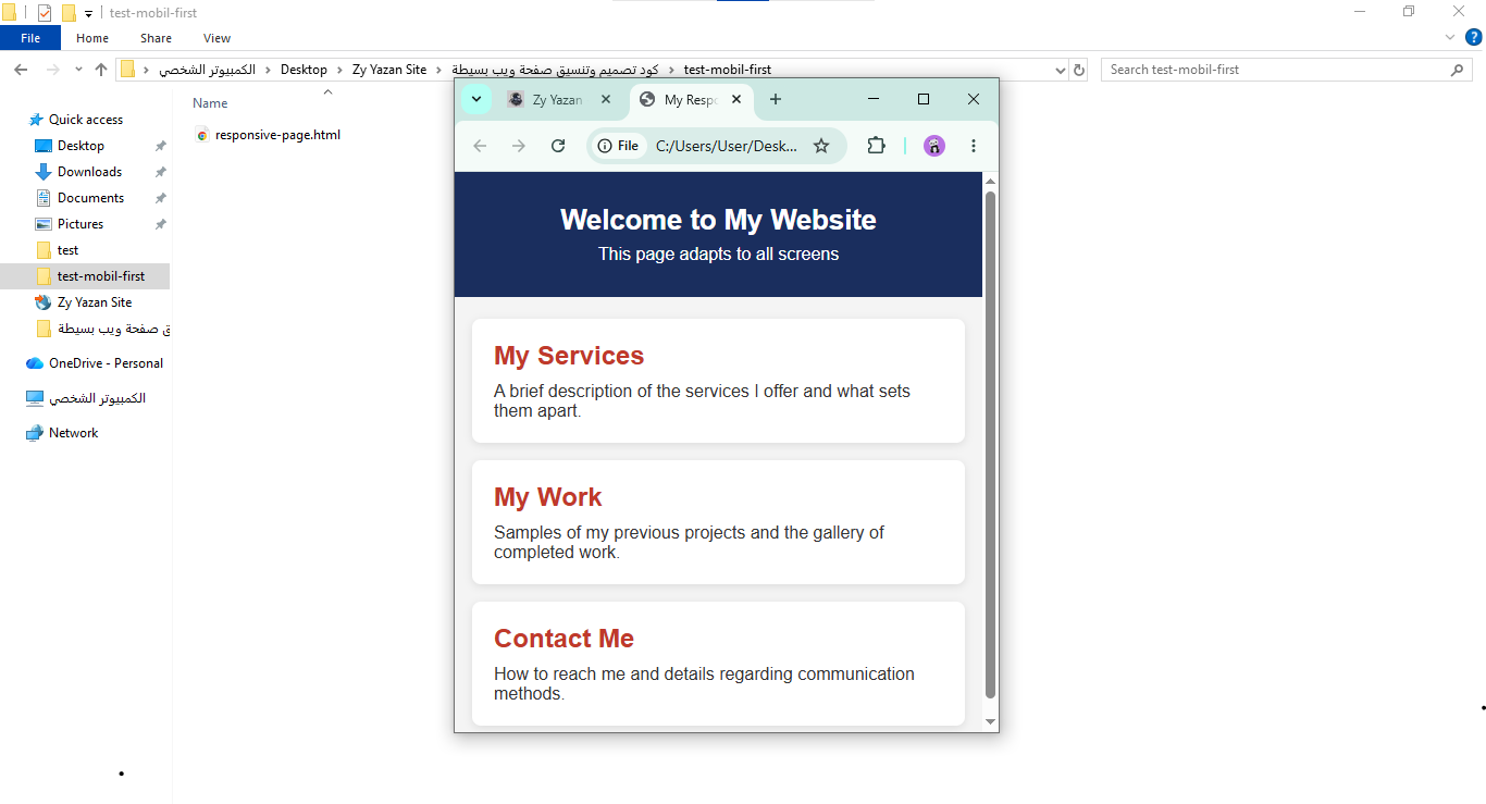
If you are using a computer, open the file in the browser, then resize the window manually or use Developer Tools (press F12, then the icon that looks like a phone and tablet). You will notice how the layout transitions smoothly from one column to two columns to three columns, like the following image:
Progressive Web Apps — When a Site Turns Into an “App”
Here we reach an idea worth pausing for: What if your website could be installed on a phone like an actual app, appearing on the home screen with its own icon and working even with a weak internet connection? This is exactly what Progressive Web Apps (PWA) mean.
A PWA is not a single technology, but a group of features you add to the site gradually (hence the word “progressive”):
The First Feature — The Manifest File
A small JSON file that tells the phone your app’s name, its icon, the address bar color, and how it should look when opened from the home screen. It is a small code snippet you add to your website’s page code:
<link rel="manifest" href="/manifest.json">
Then you create a manifest.json file next to the HTML file:
{
  "name": "My Website Name",
  "short_name": "My Site",
  "start_url": "/",
  "display": "standalone",
  "background_color": "#ffffff",
  "theme_color": "#c0392b",
  "icons": [
    {
      "src": "/icon-192.png",
      "sizes": "192x192",
      "type": "image/png"
    }
  ]
}
Of course, you will not see the effect of this procedure in a regular browser; the effect appears when you upload the site to real hosting, where a visitor to your website will see a small icon or an “Install App” button in the address bar.
The Second Feature — The Service Worker
This is the “silent server” that works behind the scenes: it saves your website files in the phone’s memory and serves them when the connection weakens or drops. Setting it up requires real hosting (not just a local file) and is a deeper topic than this article can accommodate, but it is important to know that it exists and that the path to it is not complicated when you reach that level.
The concept of PWA does not mean you are going to create a “competitor app to Twitter”! Instead, it means your doctor’s website or the blacksmith’s workshop in your neighborhood can be installed on the client’s phone and work without internet to display working hours and the address.
If You Use WordPress, What Does All This Mean to You?
You might ask: “I use WordPress and a ready-made theme, do I need all of this?” The answer: You do not need to write the code, but you do need to understand the concepts for very practical reasons:
First, when you choose a WordPress theme, you will find phrases in its description page like “Fully Responsive” or “Mobile-First Design”. Now you know what these words mean and how to verify them practically before buying.
Second, any plugin you add to your site brings code, text, and images with it, and it might slow down the mobile experience. Knowing the concept of “Mobile-First” makes you ask: “Does this plugin affect mobile speed?”
Third, with a tool like Google PageSpeed Insights, you enter your website link and it gives you a separate score for mobile and desktop with specific recommendations. You will understand these recommendations now.
Article Summary and the Next Step
We learned together that the “Mobile-First” philosophy is not just a technical method, but a way of thinking: to start from the essential and then add, not to start from the complex and then cut down. We learned how Media Queries work with the logic that “mobile is the norm”, and how a Manifest file turns your website into an app-like experience. Honest advice: open your website or the website of anyone you know on your phone right now, and pay attention to how you behave on it instinctively. That feeling of ease or frustration is the true measure of a design’s success.
Recommended Next Step:
We have mastered the form and layout, but our pages are still silent. When you click a button nothing happens, and when data is written in a field it is not processed. In the next article, we will add life to all of that: The Interactive Interface: JavaScript for Beginners, where we will learn how to talk to the browser and make it respond to every move from the reader.
References and Sources:
- MDN Web Docs documentation on Responsive Design: Responsive Design — MDN
- Google’s guide to mobile sites and PageSpeed evaluation: PageSpeed Insights
- Progressive Web Apps (PWA) documentation: Progressive Web Apps — web.dev