
Visual Psychology: How Arabic Users Read the Screen
Arabic users scan screens in a reverse-F pattern starting from the top right — and that changes everything about where you place your CTA buttons, how animations should move, and how much whitespace Arabic text actually needs.
Word count: ~2,400 · Reading time: 13 minutes
Visual Psychology: How Arabic Users Read the Screen
Getting the technical flip right isn’t enough — you need to understand how users distribute their visual attention before you decide where to put the decision button
A note for the reader: This article builds on what we established in Article 1: CSS Logical Properties and Article 2: Fixed Components. So far we’ve covered how to flip an interface and what not to flip. This article asks the deeper question: where does an Arabic user’s attention actually land on the screen? The answer will change how you design, not just how you code.
In this article from Zy Yazan, we reach the layer that sits beneath every design decision: how the eye reads. You can build a technically perfect Arabic interface — logical properties, fixed components in all the right places — and still lose the user because you put the important button in the wrong spot. Not a language error. A visual one.
This article is about eye tracking research and what it tells the Arabic interface designer.
The F-Pattern — The Full Story
In 2006, Nielsen Norman Group published a study that became one of the most cited pieces of UX research ever: Western users read digital interfaces in a pattern that resembles the letter F. They start with a horizontal sweep across the top (the top bar of the F), then a shorter horizontal sweep in the middle (the middle bar), then scan downward along the left side (the vertical stroke).
That pattern produced a golden rule in Western design: put your most important content in the upper left corner, and your primary call-to-action button on the left side or upper center of the screen.
Then came the logical follow-up question: what happens with Arabic users?

The Reverse F-Pattern — What the Research Shows
The answer most designers expect: a perfectly mirrored F — starting from the right and scanning down the right side. That answer is partially correct, but incomplete in an important way.
Eye tracking research on Arabic users — including studies from King Abdullah University of Science and Technology (KAUST) and independent research published in the journal Behaviour & Information Technology — reveals a pattern more complex than a simple “reverse F”:
- Starting point: The eye does begin at the upper right corner, not the left.
- First horizontal sweep: It moves right to left, but it’s shorter than what Western users do in the equivalent space — Arabic users tend to stop more in the middle.
- Vertical column: It runs down the right side — but attention doesn’t concentrate there as strongly as in the original Western F-pattern. Some research finds Arabic users distribute their vertical attention more toward the center.
- The neglected zone: The bottom-left corner — significantly more ignored than it is by Western users.
Arabic users don’t read the screen as a mirror image of Western users. They start from the opposite point, but they carry scanning habits shaped by years of using interfaces designed for the West. This visual hybrid is exactly what makes designing for Arabic users more nuanced than just “flipping everything.”
The Accumulated Effect of Western Interface Exposure
There’s a reality worth confronting before going further: Arabic users have spent years using interfaces designed for Western audiences — Facebook, YouTube, early Google — before localized Arabic versions became widespread. Researchers call the result Cultural Visual Adaptation.
In plain terms: today’s Arabic user carries two conflicting expectations at the same time. They expect text to flow from the right. And they expect certain interface elements (control buttons, universal icons) in their “Western” positions, because that’s where they learned them.
This has two practical implications for designers:
- Implication 1: Don’t surprise users by flipping elements they’ve learned without a functional reason — even if the flip is technically “correct.” The visual surprise disrupts interaction.
- Implication 2: New elements with no established visual expectation (new components in new apps) should follow RTL logic fully — because there’s no prior expectation to conflict with.
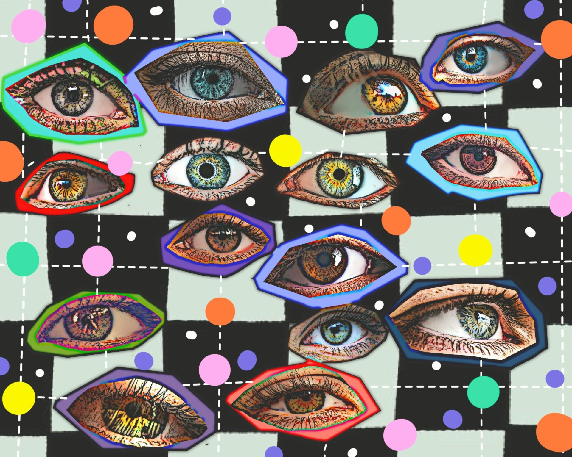
Heatmaps — Reading the Zones
Eye tracking produces what’s called a heatmap: a visual representation showing where users concentrate their gaze, with warm colors (red, orange) for high-attention zones and cool colors (blue) for ignored areas. Comparing two heatmaps — one from Western users and one from Arabic users on the same page — reveals structural differences:
| Screen Zone | Western User (LTR) | Arabic User (RTL) |
|---|---|---|
| Upper left corner | 🔴 Very hot | 🔵 Relatively cold |
| Upper right corner | 🟠 Warm | 🔴 Very hot |
| Full top horizontal bar | 🔴 Hot | 🔴 Hot |
| Left vertical column | 🟠 Warm (F column) | 🔵 Cold |
| Right vertical column | 🔵 Cold | 🟠 Warm |
| Center middle zone | 🟠 Moderate | 🟠 Moderate to warm |
| Bottom left corner | 🔵 Cold | 🔵 Very cold |
The practical takeaway from this table: the top bar is hot for everyone — put whatever you need everyone to see there. The bottom-left corner is a dead zone for Arabic users even more than for Western users — never put anything important there.
Where to Place the CTA Button
The call-to-action button determines whether a page converts a visitor into a user or watches them leave. Its placement isn’t an aesthetic decision — it’s an engineering decision built on understanding the visual path.
In Western design, the primary CTA rule is: place it in the first visual path, meaning upper left or upper center. For Arabic users, the rule branches:
Scenario 1 — Landing Page
The visitor arrives from an ad or search and is in “explore” mode. Their gaze starts upper right and moves from there. In this case:
- Primary CTA in the upper right or upper center of the screen — both fall in the hot zone.
- Avoid a lone CTA on the left middle — Arabic users may not reach it in their first scan cycle.
- If there’s a secondary CTA (learn more, browse), it can sit on the left-center — where the horizontal sweep ends.
Scenario 2 — Registration or Checkout Form
The user is in “task execution” mode — reading fields in logical sequence. Here the reading pattern differs from exploration:
- The “Submit” or “Pay Now” button should be at the bottom of the form on the right side — it falls at the natural end of the Arabic user’s reading path.
- Don’t place it at the bottom left — the user may finish reading the last field and not find the button in their visual field.
Scenario 3 — Navigation Bar
Research is consistent here: in a horizontal top navigation bar, Arabic users read elements from the right — meaning the first item they see is the one furthest to the right. That means:
- The most important nav link (Home, Products) should be the first item on the right.
- A “Sign In” or “Buy Now” button in the nav bar performs better on the left — because the user reaches it after scanning everything else, at the peak of accumulated attention.
This is a genuinely counterintuitive finding: a “Buy Now” button in Arabic navigation works better on the left — not because the left is visually prominent, but because it sits at the end of the scan path, which is the moment of decision, not the moment of discovery.
Visual Density and Whitespace
Another aspect of visual psychology that affects Arabic interface design: the visual density of Arabic text compared to English. Arabic letters connect and pack more visual weight into the same space. An Arabic word of six letters typically occupies less width than its English equivalent, but it carries higher visual density.
This produces two whitespace recommendations:
Line Height
Arabic text needs more line height than English because diacritics and vowel marks extend above and below the base letters. The recommended minimum for Arabic UI text is line-height: 1.8, compared to the 1.5 typical for English.
/* Optimized spacing for Arabic text */
:lang(ar) {
  line-height: 1.8;          /* wider than English */
  letter-spacing: 0;         /* never add letter-spacing to Arabic */
                             /* connected script — spacing breaks the letters */
  word-spacing: 0.05em;      /* slight word spacing only */
}

/* For large headings: ease the density */
:lang(ar) h1,
:lang(ar) h2 {
  line-height: 1.5;          /* tighter than body text for headings */
  font-weight: 700;          /* bold weight reads cleaner in Arabic */
}
Padding Around Interactive Elements
Buttons and links in Arabic interfaces need more internal padding than their English counterparts, because Arabic text density makes a button feel cramped at the same padding values that feel comfortable in English:
/* Button in a bilingual interface */
.btn {
  padding-block: 0.6em;          /* consistent height */
  padding-inline: 1.4em;         /* default width */
}

/* Wider padding for Arabic text density */
:lang(ar) .btn {
  padding-inline: 1.8em;         /* more breathing room */
  letter-spacing: 0;             /* confirm: no letter-spacing */
}
Motion and Visual Transitions in RTL
Animation has direction, and that direction affects whether the interface feels smooth or jarring. In LTR, the natural “forward” motion is a slide from right to left (like opening a new drawer). In RTL, the logic flips — but not always:
| Animation Type | In LTR | In RTL |
|---|---|---|
| Page transition (next) | Slides right → left | Slides left → right |
| Side drawer open | Slides in from left | Slides in from right |
| Skeleton loading | Moves left → right | Moves right → left |
| Carousel advance | Forward moves ← left | Forward moves ← right |
| Menu expand | Expands to the right | Expands to the left |
Skeleton loading deserves special attention: most CSS libraries generate the shimmer animation moving left to right by default. In an Arabic interface, that animation runs against the reading direction. It doesn’t cause a functional bug, but it creates a subtle visual discomfort that users feel without being able to name it:
/* Default skeleton animation — moves rightward (wrong for RTL) */
@keyframes shimmer-ltr {
  from { background-position: -200% 0; }
  to   { background-position:  200% 0; }
}

/* RTL skeleton animation — moves leftward */
@keyframes shimmer-rtl {
  from { background-position: 200% 0; }
  to   { background-position: -200% 0; }
}

.skeleton {
  background: linear-gradient(
    90deg,
    #f0f0f0 25%,
    #e0e0e0 50%,
    #f0f0f0 75%
  );
  background-size: 200% 100%;
  animation: shimmer-ltr 1.5s infinite;
}

/* Apply the correct animation in RTL */
[dir="rtl"] .skeleton {
  animation-name: shimmer-rtl;
}
Takeaways and What’s Next
Getting the technical flip right is necessary but not sufficient. Arabic users read the screen in a different visual pattern — starting from the right, ignoring the bottom-left corner more than Western users do, and carrying hybrid expectations shaped by years of Western interface exposure. Understanding that pattern changes practical decisions: where the CTA button goes, how transitions should move, and how much space Arabic text actually needs.
The core rule: design for the visual path first, then for language, then for code. The reverse order — code first, then language, then maybe visual — is what produces interfaces that are technically correct but visually confusing.
Across the first three articles we’ve built the complete foundation: how to code the interface (Article 1), what not to flip (Article 2), and how users see what you build (this article). Now we put all of it into practice in a real project: auditing a wrongly mirrored interface and fixing it from the ground up — which is what the fourth and final article covers.
References:
- Pernice, K. (2017). F-Shaped Pattern of Reading on the Web — Nielsen Norman Group: nngroup.com
- Alabdulkarim, L. et al. — Arabic Web Reading Patterns, Behaviour & Information Technology: tandfonline.com
- Material Design bidirectionality guidelines: Material Design — Bidirectionality
- W3C — Localizing animation direction in bidirectional interfaces: W3C Internationalization
- Our previous article in this series: Fixed Components: What Doesn’t Flip in RTL Interfaces
— RTL Interface Design Guide —
Previous article: 2 — Fixed Components: What Doesn’t Flip in RTL Interfaces
Current article: 3 — Visual Psychology: How Arabic Users Read the Screen
Next article: 4 — UI Audit Project: Fixing a Wrongly Mirrored Interface
Related series:
Hybrid Text Processing Guide | Financial Data Localization Guide | Web 3.0 & AI Localization Workshop
Zy Yazan © 2026
Localization Series
RTL Interface Design Guide — 4 Articles


Series: RTL Interface Design Guide — 4 Articles | Zy Yazan Platform © 2026