
Fixed Components: What Doesn’t Flip in RTL Interfaces
Not every element in your interface should flip when switching to RTL. Learn to identify fixed components — media players, progress bars, timelines — and why mirroring them is an engineering mistake, not a fix.
Word count: ~2,300 · Reading time: 12 minutes
Fixed Components: What Doesn’t Flip in RTL Interfaces
Not every flip is a fix — some elements carry directional meaning, and mirroring them confuses users instead of helping them
A note for the reader: This article builds on the foundation we set in Article 1: Flipping the Interface with CSS Logical Properties. If you’re new to RTL development, start there. This article covers the exceptions: the components that deliberately break the flipping rule, and how to identify and handle them.
In this article from Zy Yazan Platform, we continue the RTL Interface Design Guide at a point that trips up a lot of developers: we’ve mastered flipping layouts with logical properties, and the interface now mirrors automatically when the direction changes. But what do we do when something flips that shouldn’t?
A media player that shows its progress bar running right to left. An arrow pointing the wrong way. A timeline that runs backward through history. These aren’t “broken code” bugs — they belong to a subtler and more dangerous category: code that applies a correct rule in the wrong context.
Why Some Components Don’t Flip
The rule we established in Article 1 is simple: make your interface follow reading direction. Start from the right in Arabic, from the left in English. But some UI elements don’t express “text start and reading” — they express a physical or temporal direction with meaning independent of language.
Think about the progress bar in an audio player. Time moves left to right on every screen in the world — Arabic, English, Japanese — because it’s not expressing reading direction, it’s expressing the passage of time. Flipping it doesn’t make Arabic users more comfortable; it makes them think playback is 90% done when it’s at 10%, or that the track ends where it starts.
The difference between a flippable component and a fixed one isn’t technical — it’s semantic. The right question isn’t “does this element sit on the left?” It’s “does the direction of this element carry meaning related to time, physics, or a universal convention?” If yes, the component is fixed.
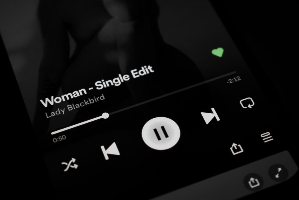
Component 1: Media Players
An audio or video player is the clearest example of a fixed component. Its progress bar represents a time axis: left is the start (second zero), right is the end (end of the track). This convention is deeply embedded in every user’s visual memory — Arabic speakers included — because they’ve used it in every media player they’ve ever seen.
Flipping that bar produces real confusion:
- The user thinks playback is at 90% when it’s actually at 10%.
- Dragging the scrubber rightward to skip ahead actually rewinds.
- The control buttons (play, pause, volume) follow a universally recognized order — scatter that order and the controls feel broken.
The fix isn’t to disable RTL on the entire player — it’s to disable it on the progress bar specifically while keeping Arabic labels and text in their correct direction:
/* Player inherits dir="rtl" from the page */
.media-player {
  display: flex;
  flex-direction: column;
  /* Text labels stay Arabic — don't touch them */
}

/* Progress bar is fixed: explicitly override RTL */
.media-player .progress-bar {
  direction: ltr;         /* Time always flows left to right */
  writing-mode: horizontal-tb;
}

/* Time display (00:45 / 03:20) stays LTR too */
.media-player .time-display {
  direction: ltr;
  font-variant-numeric: tabular-nums;
  unicode-bidi: isolate;  /* isolate from surrounding RTL context */
}

/* Controls: internal order is fixed, but align the group to page direction */
.media-player .controls {
  /* flex-direction stays row — internal order doesn't change */
  /* You can align the whole group to the right in RTL */
  justify-content: flex-end;
}
Notice we didn’t write a [dir="rtl"] rule to flip anything — we wrote direction: ltr inside the component to lock it in place. That’s the core of a fixed component: we’re not blocking RTL from the page, we’re blocking it from one specific element.
🔍 Field observation — Facebook Lite
Users of the Arabic version of Facebook Lite on Android report that the video progress bar disappears and the scrubber becomes non-functional — a behavior still present at the time of writing. The likely cause is an aggressive full-player RTL mirror that doesn’t exempt the progress bar, pushing the scrubber outside the visible area behind flipped visual layers. Facebook Lite aggressively trims code and reduces exceptions by design, and this component appears to have been caught in that process. The telling detail: the full Facebook app plays video correctly — meaning the exception exists there and was simply cut from the Lite build.
Component 2: Progress Bars — Linear and Circular
Both linear and circular progress bars share the same core issue: they express a degree of completion, not a reading direction. 75% done means the same thing in Arabic and English.
Linear Progress Bar
A horizontal progress bar typically fills from the left — empty on the right, completed portion extending from the left. This is a universal visual convention with no connection to reading direction. Flipping it in RTL creates visual confusion with no real benefit to Arabic users.
/* Fixed progress bar */
.progress-bar-track {
  direction: ltr;          /* locks fill direction */
  width: 100%;
  height: 8px;
  background: #e0e0e0;
  border-radius: 4px;
  overflow: hidden;
}

.progress-bar-fill {
  /* Width calculated in JavaScript: style="width: 75%" */
  height: 100%;
  background: #c0392b;
  /* Don't use margin-inline here — the bar is fixed */
  /* transform-origin stays on the left */
}
A legitimate exception: if the bar represents a narrative sequence rather than a quantity — like a bar showing “Unit 1 → Unit 2 → Unit 3” in a learning course — flipping it is defensible, because the order follows cultural reading logic. But for the vast majority of use cases (downloads, uploads, percentages), the bar is fixed.
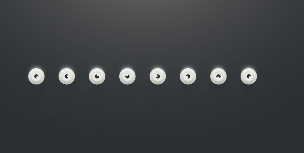
Circular Progress Bar
Circular progress makes some developers nervous because direction isn’t linear. The global convention — followed by every major UI library — is that the circle starts at the top (12 o’clock) and fills clockwise. This is a visual convention with no connection to reading direction.
/* Fixed SVG circle */
.circular-progress svg {
  /* Do NOT flip with transform: scaleX(-1) */
  /* Do NOT change stroke-dashoffset in RTL */
  /* Clockwise rotation is permanent */
}

/* If there's text inside: it inherits RTL naturally */
.circular-progress .label {
  /* No intervention — inherits dir from the page */
  text-anchor: middle;
}
The simple rule: the circle shape never changes, but text inside it follows the page direction.
Component 3: Timelines
Timelines are the most nuanced case in this topic, because they carry a genuine tension between two competing logics:
- Temporal logic: Time moves from past to future. In most global visual representations, that means left to right.
- Cultural logic: An Arabic reader starts from the right. If the oldest event sits on the left, they’ll read it after the newest events.
There’s no single correct answer here — it depends on what the timeline represents:
| Timeline Type | Recommended Decision | Reason |
|---|---|---|
| Resume or company history | Flip with RTL | User reads it like text — oldest event anchors on the right |
| Project timeline (Gantt) | Keep LTR | Time moves forward — visual logic matters more than language |
| Step progress (Stepper) | Flip with RTL | Represents a procedural sequence — follows reading logic |
| Time-series chart | Keep LTR | The X time axis is a scientific convention — reversing it misreads the data |
The deciding factor: is the user reading the timeline or analyzing it? Reading follows language. Analysis follows scientific and visual convention.
Component 4: Directional Arrows and Icons
Arrows are the most common trap in RTL interface design, because they split into two categories that are easy to confuse:
Arrows that should flip ✓
Any arrow that expresses navigation direction within the interface — forward, back, open menu, collapse — should flip with RTL:
- Pagination “Next” arrow: points left in LTR, right in RTL.
- Dropdown open arrow: points down (stays put) or sideways (flip it).
- Breadcrumb back arrow: points left in LTR, right in RTL.
Arrows that stay fixed ✗
Any arrow that expresses a fixed physical or visual concept unrelated to navigation:
- Media icons: ▶ play, ⏮ skip to start, ⏭ skip to end — these are universal symbols.
- Chart arrows expressing growth or decline.
- The compass arrow in map interfaces pointing north.
/* Navigation arrow — flips */
.nav-arrow-next {
  /* LTR: →   RTL: ← */
  /* With CSS Logical Properties it flips automatically */
  /* Or explicit transform if it's an SVG */
}

[dir="rtl"] .nav-arrow-next svg {
  transform: scaleX(-1);   /* flip the horizontal arrow */
}

/* Play icon — fixed */
.play-icon {
  /* No transform, no scaleX */
  /* ▶ stays ▶ always */
}

/* Smarter approach: use "logical" icons in modern libraries */
/* e.g. with lucide-react */
/*  flips automatically in RTL in some libraries */
/*  never flips */
A Framework for Deciding Any Component
Instead of memorizing a long list of fixed vs. flippable elements, run these three questions in order on any component you’re unsure about:
Question 1 — Does the component represent a time axis or a quantity?
If it expresses the passage of time, a completion percentage, or a measured quantity (progress bar, audio player, chart) → probably fixed.
Question 2 — Is its direction a deeply ingrained global convention?
Media icons, warning signals, scientific scales, maps → definitely fixed. Changing it creates confusion, not clarity.
Question 3 — Will the user read it like text, or interact with it as a tool?
If it’s read (steps, biography, pagination) → flip it. If it’s used as a visual tool (dashboard, chart, player) → keep it.
The goal of this framework isn’t to automate the decision — it’s to shift it from a technical question (“should I add scaleX(-1)?”) to a semantic one (“what does this component mean to the user?”). Meaning comes first. Code follows.
Implementing Fixedness: The Tools Available
Once you’ve decided a component is fixed, you have three tools to enforce that in code:
Tool 1 — Explicit direction: ltr
The simplest and most readable: write direction: ltr directly on the component. It overrides the inherited direction from the page. Best for full containers like media players.
Tool 2 — unicode-bidi: isolate
Doesn’t change the direction — isolates the component from the surrounding bidi context. Useful when you want the component to rely on its own internal direction without the page interfering. We used this in Article 1 for timestamp numbers.
Tool 3 — transform: scaleX(-1)
Flips an SVG icon or image visually without changing text flow direction. Used for navigation arrows in RTL when the original points right and you need it to point left. Never use it on time or quantity components.
/* Summary of the three tools */

/* 1 — Lock direction: for full containers */
.media-player .progress-bar {
  direction: ltr;
}

/* 2 — Bidi isolation: for inline elements */
.time-code {
  unicode-bidi: isolate;
  direction: ltr;
}

/* 3 — Visual flip: for icons in RTL context */
[dir="rtl"] .nav-chevron-right {
  transform: scaleX(-1);
}

/* What you never do: flip the entire media player */
/* [dir="rtl"] .media-player { transform: scaleX(-1); } ← wrong */
Takeaways and What’s Next
A good RTL interface isn’t one where everything flipped — it’s one where the right things flipped and the right things held their ground. Mixing up those two categories is the source of most visual errors you see in Arabic websites today.
The rule we built here: a component that expresses time, quantity, or a universal visual convention is fixed. A component that expresses navigation direction or reading order is flippable. When in doubt, ask: what does this element mean to the user? The meaning determines the direction, not the other way around.
In Articles 1 and 2 we covered the mechanics of flipping and its limits. But we haven’t yet asked the deeper question: how does an Arabic user actually read a screen? Does their eye follow a different pattern than a Western user’s? And how does that affect where you place decision buttons? That’s what Article 3 covers: Visual Psychology.
References:
- Material Design bidirectionality guidelines: Material Design — Bidirectionality
- Apple Human Interface Guidelines for RTL: Apple HIG — Right to Left
- W3C internationalization guidance: W3C Internationalization — Authoring HTML
- Our previous article in this series: CSS Logical Properties for RTL Interfaces
— RTL Interface Design Guide —
Previous article: 1 — CSS Logical Properties for RTL Interfaces
Current article: 2 — Fixed Components: What Doesn’t Flip in RTL Interfaces
Next article: 3 — Visual Psychology: How Arabic Users Read the Screen
Related series:
Hybrid Text Processing Guide | Financial Data Localization Guide | Web 3.0 & AI Localization Workshop
Zy Yazan © 2026
Localization Series
RTL Interface Design Guide — 4 Articles


Series: RTL Interface Design Guide — 4 Articles | Zy Yazan Platform © 2026