Visual Formatting: How to Transform Silent Structures into Stunning Pages with CSS

A practical guide to learning CSS from scratch: colors, fonts, layouts, and responsiveness, featuring a dedicated section on mistakes that separate beginners from pros.
Word count: ~2800 · Reading time: 14 minutes
Visual Styling
How to transform silent structures into stunning pages using CSS — from a single line changing a color to layouts that adapt to every screen
A quick note, my friend: This article builds directly on what we created last time. If you haven’t gone through the HTML stage yet, I highly recommend starting with: The Language of Structure: Learn HTML Basics to Build Your First Web Page from Scratch, as we will be styling the exact page we built there.
In the previous article, we built a fully structured web page—complete with a header, sections, a footer, links, and lists. But when we opened it in the browser, it was just plain black text on a white background with absolutely zero visual appeal. That is exactly how it is supposed to look without CSS. In this guide from Zy Yazan Platform, we are going to learn together how to dress up those bare bones with colors, sizes, and layout choices, and how to make your page look completely different on a smartphone compared to a desktop without writing two separate sets of code!

What is CSS, the “Soul of Visual Design,” and How Does It Connect to HTML?
If HTML is the “skeleton” or the silent, bare walls of the building we learned to raise last time, then CSS (short for Cascading Style Sheets) is the paint, lighting, decor, and furniture that give this building its visual identity and bring out its true beauty. Without CSS, every website in the world would look like the exact same boring document: stacked black text, blue underlined links, and massive images filling up the screen randomly. The core job of CSS is to answer one simple question: how should this element look to the user?
Why Is It Called “Cascading”? (The Secret of Cascading)
The word “Cascading” isn’t just a fancy technical term; it describes how the browser actually thinks. This property means that styling rules flow and apply from top to bottom, exactly like a waterfall. If you tell the browser in line 1 to make a paragraph “blue,” and then come back in line 10 and tell it to make that same paragraph “red,” the browser will adopt the last (newest) rule and override what came before it. This cascading nature is the main reason beginners get frustrated when they write 100% correct styling code but don’t see any changes on the screen—there is almost always another rule further down the file or a more specific one overriding theirs without them realizing it!
How Does CSS Code Think? (The Simple Formula)
Writing CSS is way easier than you think. It does not involve any complex logic or equations. Instead, it relies on a simple three-part formula: (Target ➔ Property ➔ Value). Take a look at this example:
p {
  color: red;
  font-size: 18px;
}
Here is exactly what we did:
* **Target (Selector):** The letter `p`. We are telling the browser, “Hey browser, go find all the text paragraphs on this page.”
* **Property:** `color` and `font-size`. These are the attributes we want to change.
* **Value:** The color `red` and the size `18px`. We end each instruction line with a semicolon `;` to confirm the order is complete.
Three Ways to Link CSS to Your Page
If you have ever written or managed articles on WordPress before, you might have used the “Customize” button and then the “Additional CSS” box to tweak a color or a font on your site. In real-world web development, it works exactly the same way. The browser reads CSS code in three different flavors. Understanding these now will make it effortless for you to control your site’s files when we make our next move to self-hosting:
1. The Pro Way: External Stylesheet Instead of cramming styling code inside your website’s pages, professionals write all the styles in a completely separate file, usually named something like `style.css`. We link this file to our webpage with a single, smart line placed at the very top of the page inside the `<head>` section. To give you a practical example: when you use a ready-made WordPress theme, it comes bundled with an external file exactly like this one, styling your whole site behind the scenes without you ever having to look at it.
2. The Quick Way: The <style> Tag Here, we don’t create a new file. Instead, we carve out a dedicated space for styling at the top of the same webpage using a `<style>` tag and write the code inside it. This is identical to pasting code into the “Additional CSS” box in WordPress. It is brilliant for quick testing and minor tweaks, but it makes your page bloated and slow if your styles grow too long.
3. The Emergency Way: Inline Styles This means going directly to the element itself (like a specific paragraph or a particular heading) and forcing it to take a style using the `style` attribute right there, like writing: `<p style=”color: red;”>`. Avoid this method as much as possible, brother, because it turns future site updates into an absolute nightmare. Imagine wanting to change your site’s accent color from red to blue—you would have to manually hunt down every single element instead of changing just one line in an external file!
Let’s try the professional way together to style the webpage we created in the last article, which we saved as `index.html`. We will write all our rules in a separate file named `style.css` and link it to our HTML page inside the `<head>` section. Let’s start by adding this line to your `index.html` file:
<link rel="stylesheet" href="style.css" />
This means the top of your file, after adding this line, will look like this:
<head>
  <meta charset="UTF-8" />
  <meta name="viewport" content="width=device-width, initial-scale=1.0" />
  <title>My First Web Page</title>
  <link rel="stylesheet" href="style.css" />
</head>
Before we write our stylesheet, let’s break down how these styling rules are put together…
The Anatomy of a CSS Rule: Selector, Property, and Value
Every single CSS rule follows the exact same three-part structure:
Selector {
  property: value;
  another-property: value;
}
* **Selector:** This is who you are talking to. Do you want to style all paragraphs? A specific element with a unique ID? Or all elements sharing a certain class?
* **Property:** This is what you want to change, such as color, size, or spacing.
* **Value:** This is the new setting you want to apply instead of the default browser look.
Let’s look at a live, practical example:
/* Every paragraph on the page */
p {
  color: #333333;
  font-size: 1.1rem;
  line-height: 1.8;
}

/* A single element with a unique ID */
#main-title {
  color: #c0392b;
  text-align: center;
}

/* All elements carrying this class */
.highlight {
  background-color: #fff3cd;
  padding: 10px;
}
Essential Selectors to Get You Started
| Selector | Example | What Does It Target? |
|---|---|---|
| Element Selector | h2 { } | Every h2 element on the page |
| Class Selector | .card { } | Any element with class="card" |
| ID Selector | #hero { } | The single unique element with id="hero" |
| Universal Selector | * { } | Absolutely every element on the page with no exceptions |
| Pseudo-class | a:hover { } | A link, but only when the user hovers their mouse pointer over it |
| Descendant Selector | nav a { } | Any link that lives inside a nav element |
The Box Model: The Truth That Explains Everything
Every HTML element—every paragraph, heading, and image—is fundamentally a box. This box consists of four nested layers, collectively called the “Box Model”:
* **Content:** The actual text or image itself.
* **Padding:** The inner clearance space between the content and the box’s edge. It inherits the element’s background color.
* **Border:** The line wrapped around the padding and content. It can be visible, invisible, thick, or thin.
* **Margin:** The outer spacing between this box and its neighboring elements. It is always completely transparent.
.my-box {
  /* Content */
  width: 300px;
  height: 150px;

  /* Inner spacing */
  padding: 20px;

  /* Border */
  border: 2px solid #c0392b;

  /* Outer spacing */
  margin: 30px auto; /* 'auto' centers the box horizontally */

  /* Colors */
  background-color: #f9f9f9;
  color: #333;
}
Mastering the Box Model solves 70% of the spacing and alignment head-scratchers that drive beginners crazy. Whenever you spot an element that isn’t sitting where it belongs, your very first question should be: What are the margin, padding, and border values for this element and the ones next to it?
Colors and Typography: Where Do You Start?
Colors in CSS
CSS accepts colors in a handful of formats. The most common are Hexadecimal codes (Hex) like `#c0392b`, RGB values like `rgb(192, 57, 43)`, and HSL values like `hsl(6, 63%, 46%)`—which modern designers absolutely love because it’s way more intuitive to tweak by eye. You can also use direct keywords like `red` or `transparent` for quick setups.
Pro tip: Pick a limited color palette right out of the gate—a primary color, a secondary accent, and three shades of grey for text and backgrounds. Define them as variables at the top of your CSS file:
:root {
  --color-primary:   #c0392b;
  --color-secondary: #1a3a5c;
  --color-text:      #333333;
  --color-muted:     #666666;
  --color-bg:        #ffffff;
}

h2 { color: var(--color-primary); }
p  { color: var(--color-text); }
Using CSS variables like this makes changing your site’s entire color scheme down the road a matter of editing one single line instead of a hundred!
Fonts and Typography
The typography you choose defines the personality of your site more than you think. Browsers come with plain, uninspired default fonts. The easiest way to fix this is to pull a gorgeous, clean font from Google Fonts for free:
/* Inside the <head> of your HTML file */
<link href="https://fonts.googleapis.com/css2?family=Cairo:wght@400;700&display=swap" rel="stylesheet">
/* Inside your CSS file */
body {
font-family: 'Cairo', sans-serif;
font-size: 1rem; /* 1rem = browser default font size, usually 16px */
line-height: 1.8; /* Spacing between lines = 1.8 times the font size */
color: var(--color-text);
}The `rem` unit deserves a quick shoutout: it is always relative to the font size of the root “ element, not the immediate parent element like `em` does. This makes your layout completely predictable and much better for accessible website sizing.
Layouts: Flexbox and Grid
A decade ago, arranging elements horizontally required messy hacks and unstable workarounds. Today, we have two incredibly powerful, crystal-clear layout engines.
Flexbox: For One-Dimensional Layouts
Flexbox organizes elements in a single direction (either a row or a column). It is the perfect choice for navigation bars, service cards, or any group of items you want to line up neatly side-by-side:
.nav-links {
  display: flex;
  gap: 24px;                  /* Uniform spacing between links */
  align-items: center;        /* Perfect vertical centering */
  justify-content: flex-start; /* Align elements to the left */
}

.cards-container {
  display: flex;
  flex-wrap: wrap;            /* Wrap items to the next line if space runs out */
  gap: 20px;
  justify-content: center;
}
Grid: For Two-Dimensional Layouts
Grid manages items in rows and columns simultaneously. It is best suited for structuring whole page layouts, media galleries, and e-commerce product grids:
.portfolio-grid {
  display: grid;
  /* Three equal columns that perfectly fill the available width */
  grid-template-columns: repeat(3, 1fr);
  gap: 24px;
}

.page-layout {
  display: grid;
  /* A fixed sidebar alongside a completely flexible main content area */
  grid-template-columns: 280px 1fr;
  gap: 32px;
}
Don’t waste time debating which one is better: use Flexbox for linear elements lined up in one direction, and Grid for complex multi-axis layouts. These tools are built to complement each other, and using them together on the same page is standard, professional practice.
Responsive Design: The Principle of Bending, Not Breaking
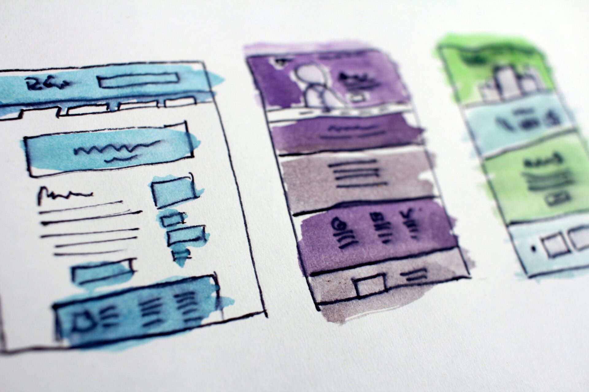
A truly responsive website doesn’t involve building separate versions for phones and desktops. Instead, you write a single layout that automatically refolds and scales when the screen resizes. Our primary tool for this magic is “Media Queries”:
/* Default layout: Mobile-first approach */
.cards-container {
  display: flex;
  flex-direction: column; /* Stacked in a single column on mobile */
  gap: 16px;
}

/* When the viewport opens up to 768px or wider */
@media (min-width: 768px) {
  .cards-container {
    flex-direction: row;  /* Snap into a horizontal row on tablets/desktops */
    flex-wrap: wrap;
  }
}

/* When the viewport hits 1200px or wider */
@media (min-width: 1200px) {
  .cards-container {
    gap: 32px;
  }
}
The “Mobile-First” approach means you build the phone layout as your baseline code, then add layers of instructions for larger viewports as screen space permits. This is the exact opposite of what many beginners do—designing a massive desktop site first and then trying to painfully “compress” it down for mobile later.
To explore this critical topic in depth, we have dedicated an entire guide to it in this series: Mobile-First Environments: Designing Dedicated Responsive Layouts for Smartphones.
Our Page After Adding CSS: Before and After
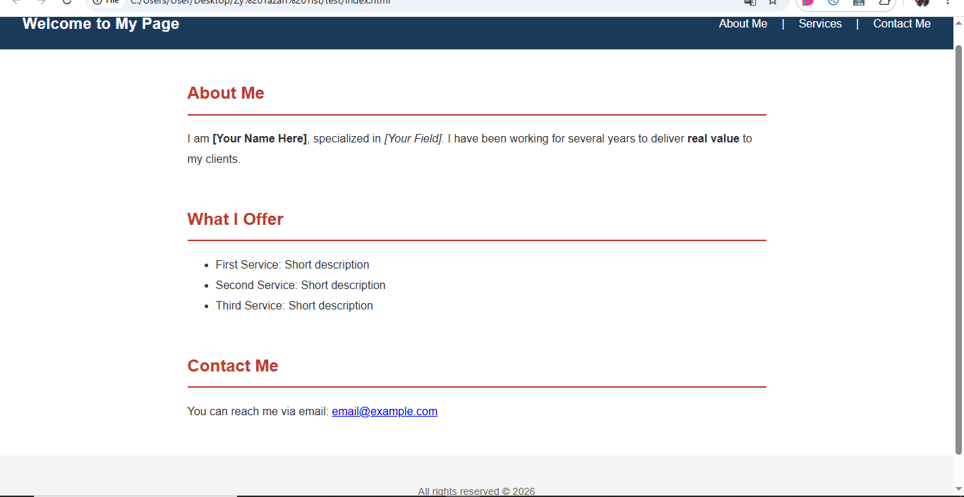
Now that we’ve unlocked the core concepts and styling commands, let’s circle back to our `index.html` file from last time. Here is the complete, production-ready CSS file that applies everything we discussed today to our HTML foundation. Save this code into a file named `style.css` inside the exact same folder as your page, reload `index.html` in your web browser, and you will see a massive transformation instantly!
🛠️ Important Troubleshooting Step for File Saving:
If you save your code and it still launches as a plain text file, your operating system is likely hiding file extensions automatically. Follow these quick steps right away:
- For Windows Users: Open your folder → click on View at the top menu → check the box for File name extensions. If your file now reads `index.html.txt`, simply rename it and delete the `.txt` from the very end.
- For Mac Users: Right-click or Command-click the file → choose Rename → change the file extension from `.txt` to `.html` and hit accept on the prompt.
The moment you strip out the `.txt` extension, the file icon will change to your system’s default browser logo, making it ready to run as a live webpage! Make sure to do the exact same thing for your stylesheet file to ensure it’s named `style.css` rather than `style.css.txt`.
/* 1. Global Reset & Settings */
*, *::before, *::after { box-sizing: border-box; }

:root {
  --color-primary:   #c0392b;
  --color-secondary: #1a3a5c;
  --color-text:      #333;
  --color-muted:     #666;
}

/* 2. Global Body Styling */
body {
  font-family: 'Cairo', sans-serif;
  font-size: 1rem;
  line-height: 1.8;
  color: var(--color-text);
  margin: 0;
  padding: 0;
}

/* 3. Header & Navigation Layout */
header {
  background-color: var(--color-secondary);
  color: white;
  padding: 16px 32px;
  display: flex;
  justify-content: space-between;
  align-items: center;
}

header h1 { margin: 0; font-size: 1.4rem; }

nav { display: flex; gap: 20px; }
nav a { color: white; text-decoration: none; }
nav a:hover { text-decoration: underline; }

/* 4. Main Content Layout */
main {
  max-width: 860px;
  margin: 40px auto;
  padding: 0 20px;
}

section { margin-bottom: 48px; }

h2 {
  color: var(--color-primary);
  border-bottom: 2px solid var(--color-primary);
  padding-bottom: 8px;
}

/* 5. Footer Layout */
footer {
  text-align: center;
  padding: 24px;
  background-color: #f4f4f4;
  color: var(--color-muted);
  font-size: 0.9rem;
}

/* 6. Mobile Responsiveness */
@media (max-width: 600px) {
  header { flex-direction: column; gap: 12px; text-align: center; }
  nav    { flex-wrap: wrap; justify-content: center; }
}
When you open your updated `index.html` file, your structural markup will look beautifully styled and fully aligned!
7 Invisible Mistakes That Separate Beginners from Professionals
While the instructions above give you the perfect foundation, there is a whole category of visual bugs that standard textbook tutorials skip entirely. You only cross paths with them when you build a real-world project and sit in front of your screen completely stumped. These seven mistakes are what visually divide a site that “works” from a platform that looks like a masterpiece.
1. The Image Layout Shift Trap
When a web page loads and images land a few seconds after the text, the layout jumps and shifts abruptly. This behavior is called “Cumulative Layout Shift” (CLS)—and it isn’t just visually irritating; it actively hurts your site’s speed scores on Google. The issue stems from the browser not knowing an image’s dimensions before downloading it, causing it to allocate zero initial space and recalculate the page layout on the fly.
img {
  width: 100%;
  aspect-ratio: 16 / 9;   /* Locks the space in place before download finishes */
  object-fit: cover;       /* Crops clean without stretching or squishing */
  display: block;          /* Removes default inline baseline gap below images */
}
The `aspect-ratio` property tells the browser the exact aspect ratio ahead of time so it reserves the space, while `object-fit: cover` ensures the photo scales beautifully within its box like a widescreen film frame—perfectly centered and cropped instead of distorted.
2. The Collapsing Margin Illusion
This is one of the most confusing quirks for beginners: you add `margin-top` to a child element inside a parent box, only to watch the entire parent box shift downward instead of moving the child inside it. This happens because, by default, the browser merges adjacent vertical margins into a single margin, applying only the largest one.
/* The Fix: Turn the parent element into an independent formatting context */
.parent {
  display: flow-root; /* Halts margin collapse with zero visual side-effects */
}

/* Or add a tiny bit of padding to block the collapse */
.parent {
  padding-top: 1px;
}
Professionals don’t just keep cranking up margin values until things “look right”—they understand why the browser handles layout spaces this way and fix it at the root.
3. The Myth of Vertical Baseline Alignment
Placing an icon right next to a line of text, or combining different font sizes in a single line, often results in items looking completely unaligned despite your best efforts. Using `vertical-align: middle` rarely yields a perfect look because it aligns items relative to the typographic font baseline, not the absolute visual center of the block.
/* The bulletproof solution: Flexbox */
.icon-with-text {
  display: flex;
  align-items: center; /* Flawless visual centering regardless of size */
  gap: 8px;
}

/* When you need text items to line up exactly on their baseline */
.mixed-size-text {
  display: flex;
  align-items: baseline; /* Aligns the text baseline across different font sizes */
}
4. The Sudden Break Cutoff for Long Text
Inside card UI designs, text blocks often run longer than the allocated space. While using the standard `text-overflow: ellipsis` approach works, it slices the sentence off abruptly with three dots. A far more elegant, professional design choice is to fade out the text smoothly as it nears the boundary:
.card-text {
  max-height: 120px;
  overflow: hidden;
  /* Mask gradient that gently dissolves text edges */
  mask-image: linear-gradient(to bottom, black 60%, transparent 100%);
  -webkit-mask-image: linear-gradient(to bottom, black 60%, transparent 100%);
}
This treatment hints to the reader’s eye that there is more content to explore without interrupting their reading experience with a sharp, broken line.
5. The Fixed Padding Layout Break
You style a page perfectly on a mid-sized monitor, but when you view it on a massive ultra-wide screen, the white spaces expand into vast empty voids, while on a mobile screen they feel cramped and choked. This occurs because you are using fixed pixel units (`px`) or basic percentages (`%`) for major structural padding sections:
/* Instead of: padding: 80px;  ← Rigid; looks ridiculously massive on laptops */
/* Or instead of: padding: 10%;  ← Linear; shrinks down to nothing on small phones */

/* The Solution: clamp(minimum, fluid-value, maximum) */
section {
  padding: clamp(2rem, 5vw, 8rem);
}

h1 {
  font-size: clamp(1.6rem, 4vw, 3.2rem);
}
The `clamp()` function provides direct instructions to the browser: “Never drop below `2rem` on small displays, never exceed `8rem` on massive screens, and scale fluidly at `5vw` everywhere else.” This lets your layout breathe completely naturally across devices without requiring manual adjustments at every single breakpoint.
6. The Horizontal Page Overflow Disaster
This is easily one of the most frustrating experiences for web design beginners: you set an element’s width to `100%`, add some `padding` or a `border`, and suddenly the box spills past the viewport edge, creating a broken horizontal scrollbar. This happens because, by default, the browser calculates width strictly based on inner content space, throwing padding and borders *on top* of your specified size.
/* This rule should be placed at the very top of every single stylesheet you write */
*, *::before, *::after {
  box-sizing: border-box;
  /* Now a width of 100% means exactly 100%, including padding and borders */
}
This simple snippet corrects the browser’s box rendering engine globally, forcing it to act logically: “If I request a 300px box, I mean exactly 300px overall, including its edges.”
7. Operating on Unstable Default Layout Grounds
Every web browser ships with its own hardcoded default styles for HTML elements—varying baseline margins for headings, differing padding for lists, and distinct styles for buttons and inputs. This means your project will inevitably look slightly altered when moving from one browser to another before you even write a single line of your own CSS. The fix is to apply a global normalization reset right at the top of your stylesheet:
/* Clean, lightweight global reset layout */
*, *::before, *::after { box-sizing: border-box; margin: 0; padding: 0; }

body {
  min-height: 100vh;
  text-rendering: optimizeSpeed;
  -webkit-font-smoothing: antialiased;
}

img, video { max-width: 100%; display: block; }

button, input, select, textarea {
  font: inherit; /* Input elements do not inherit body typography by default */
}
Experienced creators kick off every layout configuration with this reset file. Building on uniform ground keeps you from wasting hours debugging cross-browser presentation quirks that weren’t even caused by your own code!
The line that separates a beginner from a veteran isn’t simply knowing a massive dictionary of styling properties; it’s understanding exactly why browsers render elements the way they do. When you look past the surface layout behaviors, you pinpoint the fix immediately. When you guess, you spend hours tossing random numbers at properties until it “looks okay” on Google Chrome, only to open Firefox or Safari later and find the layout completely broken!
Summary
Today we explored how CSS acts as the master visual design layer that turns raw HTML code into a beautifully styled interface. We saw how the Box Model dictates every bit of element padding and spacing across your site, and how Flexbox and Grid give you complete layout control without needing old layout workarounds. Finally, we unpacked seven critical bugs that textbooks skip over, giving you the insights needed to elevate your work to a professional standard.
A word of advice from the heart:
Whether you are a writer, editor, site administrator, or an aspiring web developer, you don’t need to memorize strings of code or master every single technical nuance of development languages today. In our current era of AI models, getting hundreds of lines of code generated for you takes only a few seconds.
However, the fundamental quality that separates an expert creator from someone simply copying text comes down to one question: Do you possess the foundational knowledge needed to read that code, spot issues, refine it, and communicate exactly what you want to AI tools?
Without absorbing the core concepts we discussed today, you won’t know what to ask for or how to fix a minor layout error when it pops up on your screen. You might even struggle to see where a code block starts and ends, making it impossible to copy and paste into place without introducing bugs. Always aim to understand how things work under the hood rather than trying to memorize lines of code.

Recommended Next Step:
We have successfully mastered structured page markups and visual formatting styles, and our layout looks excellent across desktop monitors. Join me in our next guide: Mobile-First Environments: Designing Dedicated Responsive Layouts for Smartphones. We will dive deep into mobile-first development paradigms and learn exactly how to build web experiences that adapt flawlessly to mobile screens.
References & Sources:
- Official CSS Documentation on MDN Web Docs: MDN CSS Reference
- Interactive Flexbox Implementation Guide: A Complete Guide to Flexbox — CSS-Tricks
- Interactive Grid Implementation Guide: A Complete Guide to CSS Grid — CSS-Tricks
- Visual HSL Color Configuration Palette: HSL Color Picker
— Web Design Guide Series —
Previous Article: 4- The Language of Structure: HTML
Current Article: 5- Visual Styling: CSS
Next Article: 6- Mobile-First Environments
Related Series: Blogging Guide | Multimodal Blogging Workshop | SEO Guide
Zy Yazan Platform © 2026
Freelancer Workshops
Web Design Guide — 14 Articles










Series Web Design Guide — 14 Articles | ZYYAZAN Platform © 2026